Historical Preservation and Urban Regeneration
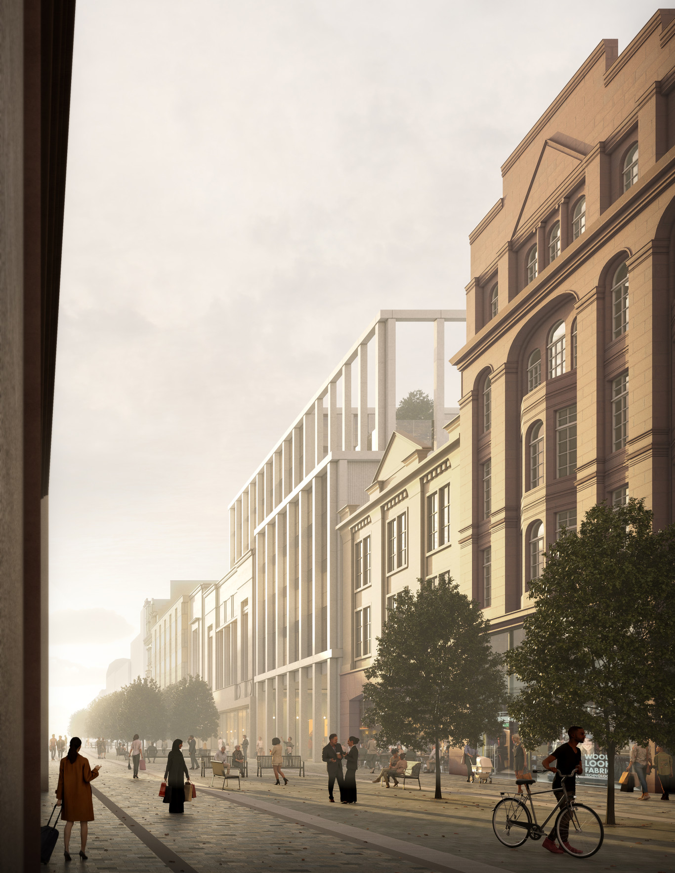
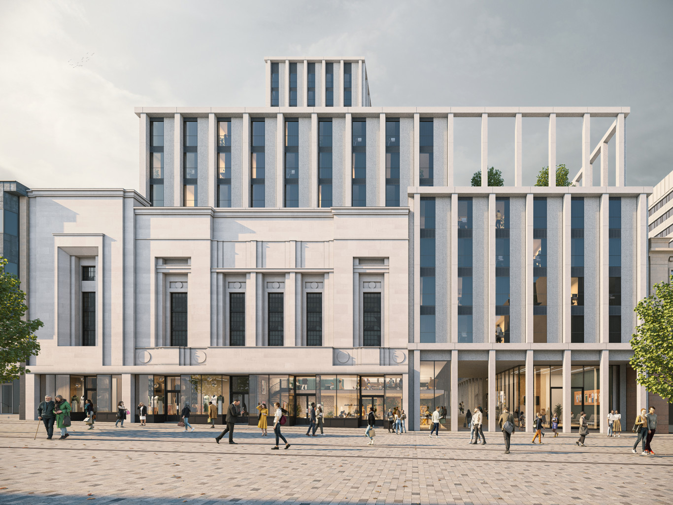
Sauchiehall Street provides much needed new purpose-built student accommodation and retail space on one of Glasgow City Centre’s most historic and important streets. The proposals incorporate the existing former Marks & Spencer department store, built in 1935 as part of a series of modular buildings designed by Robert Lutyens.
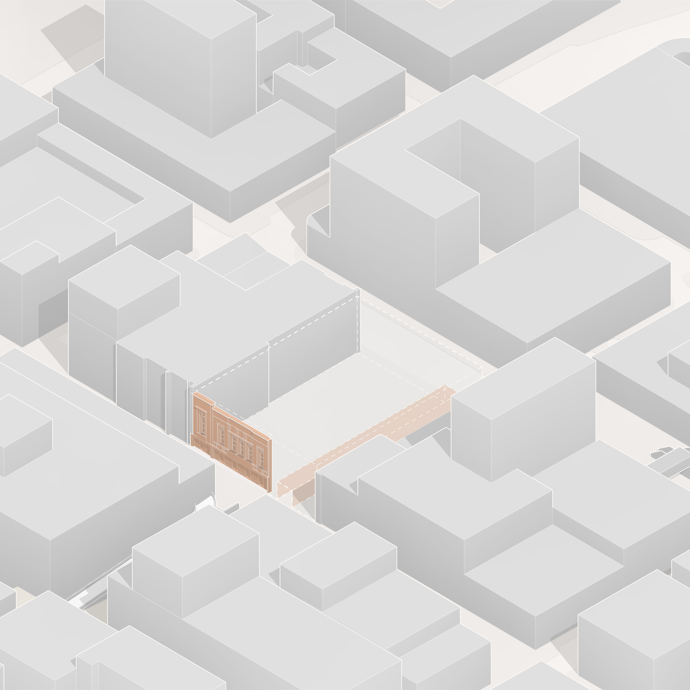
Along with retaining the Marks & Spencer 1930’s Art Deco facade our design reintroduces the historic Wellington Arcade, re-linking Sauchiehall Street and Renfrew Street and reinstating a key piece of the city grid, helping to further contribute the to the long term vitality of both streets.
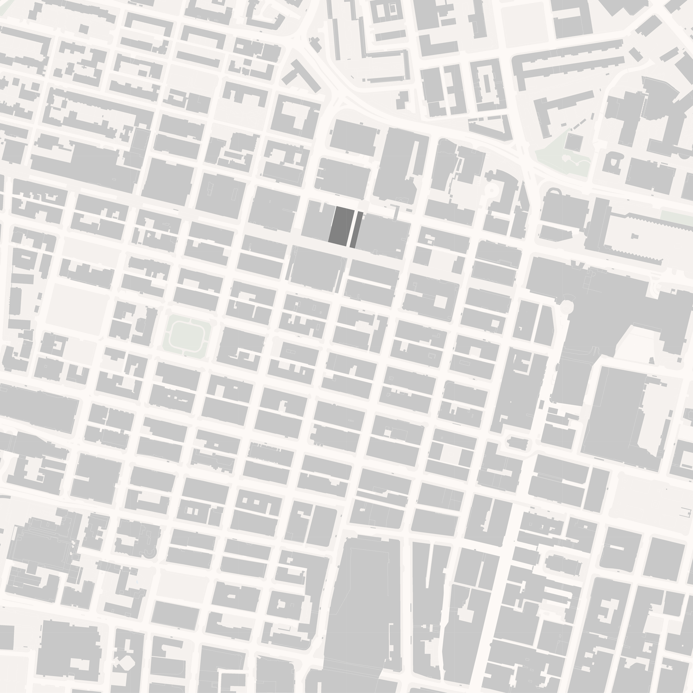
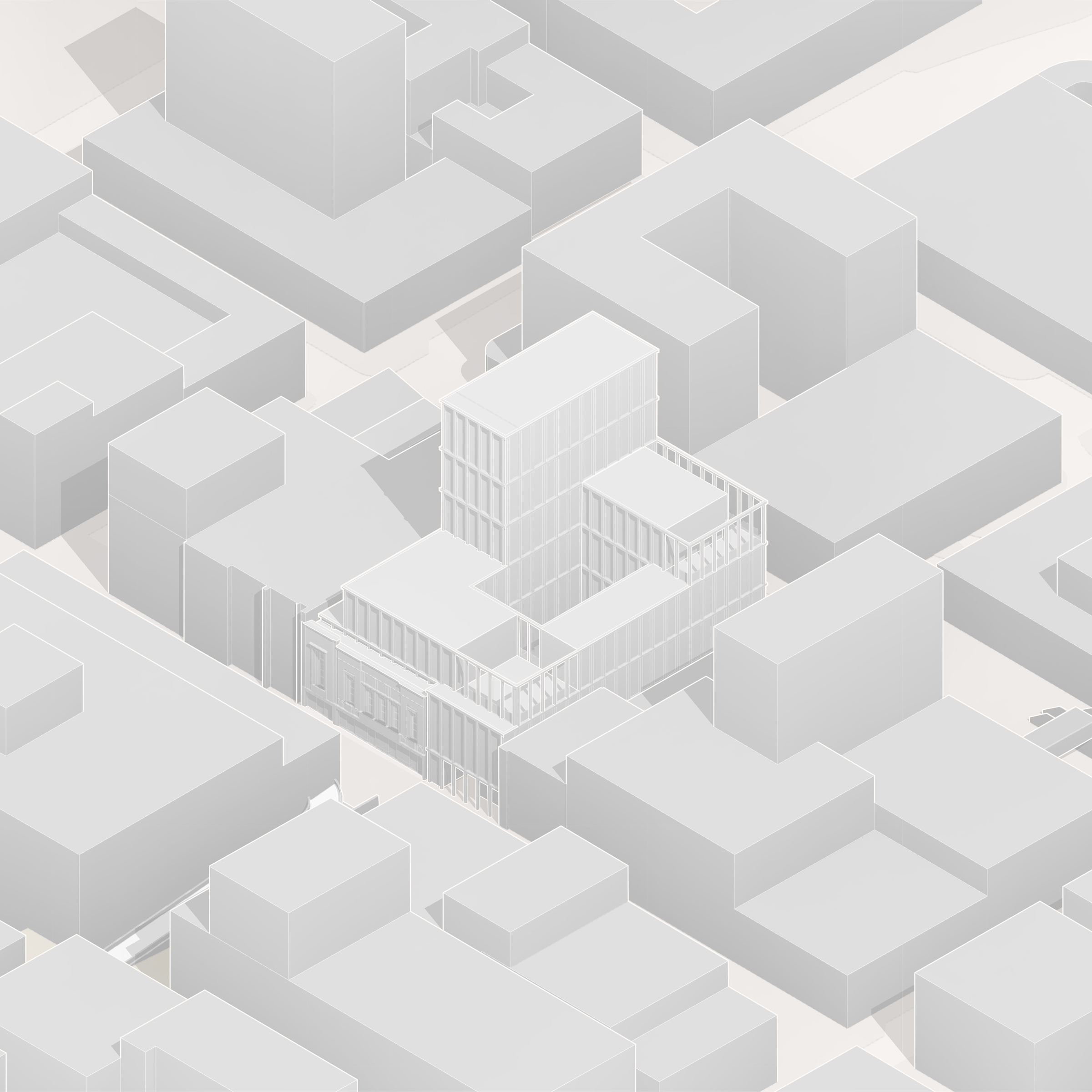
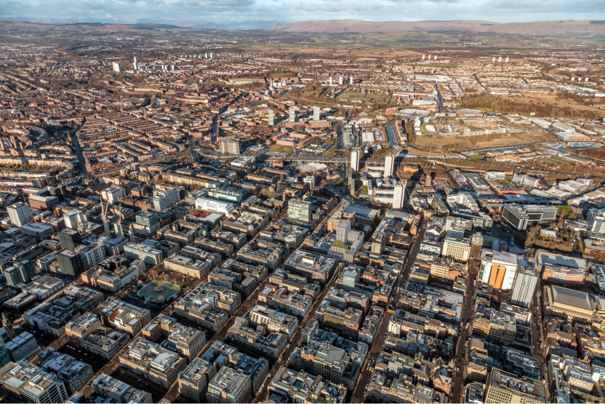
The site occupies a prime, central location in the heart of Glasgow City Centre, within a conservation area and near to a number of listed buildings. In addition to carefully integrating the existing Art Deco facade into the proposals and reinstating the historic arcade, the design reflects the character of Glasgow which stems from its robust historic buildings born out of the city grid.
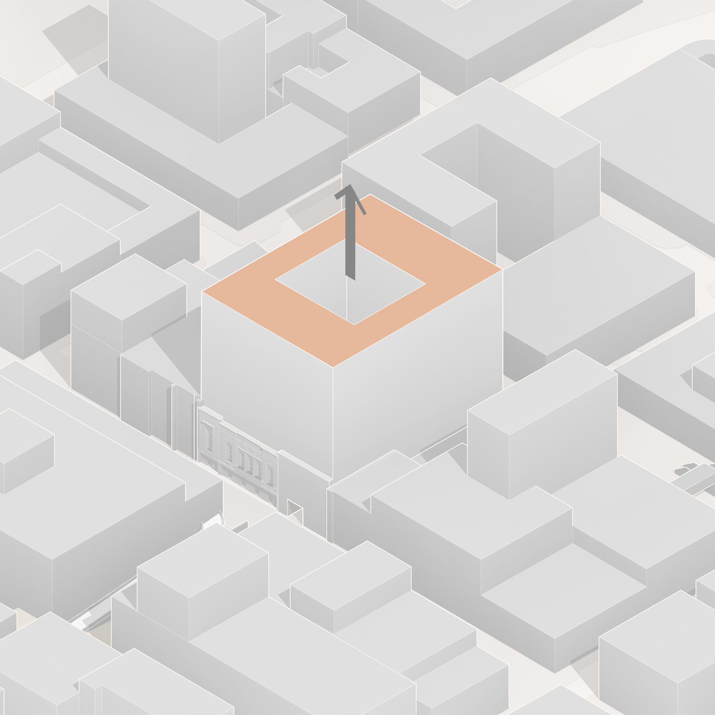
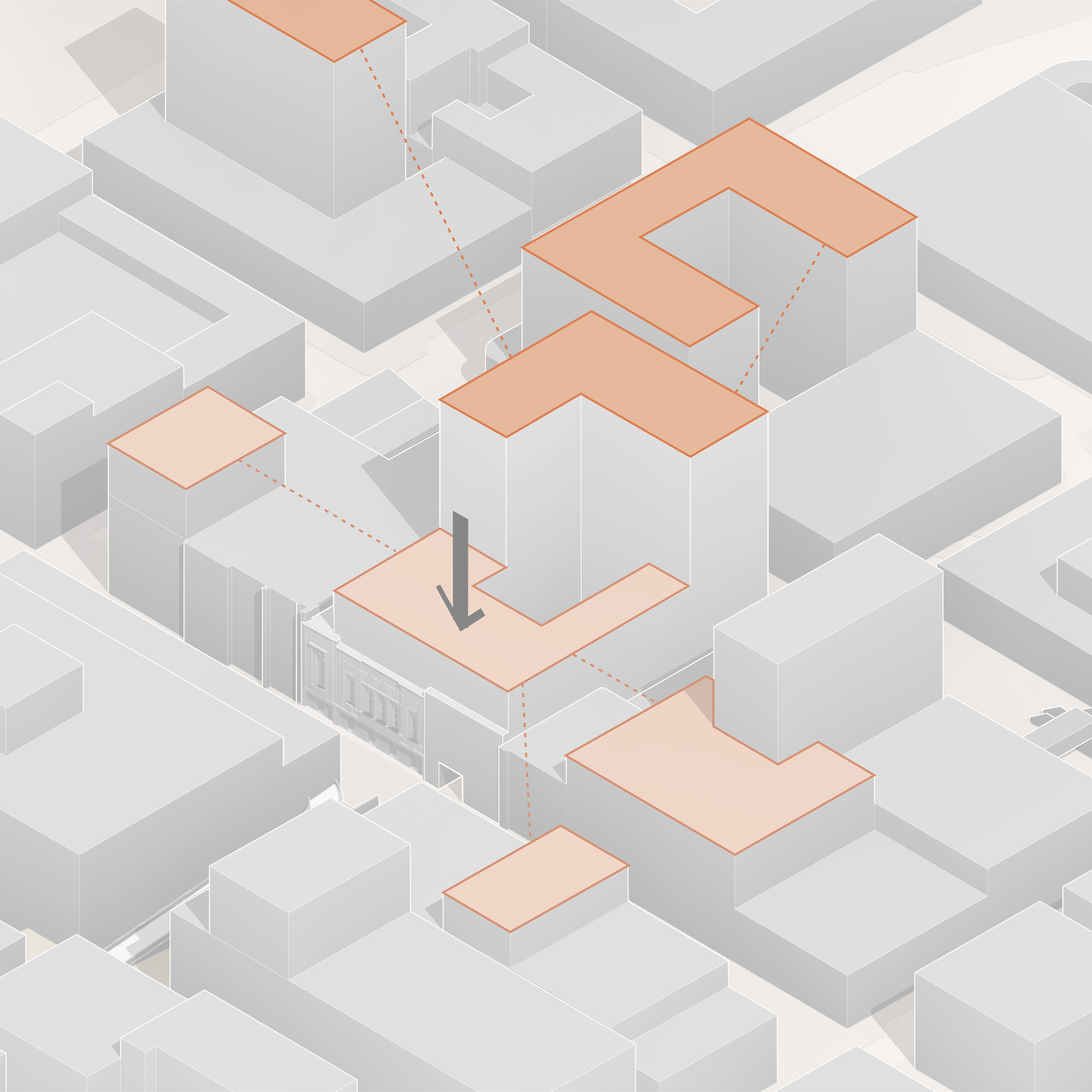
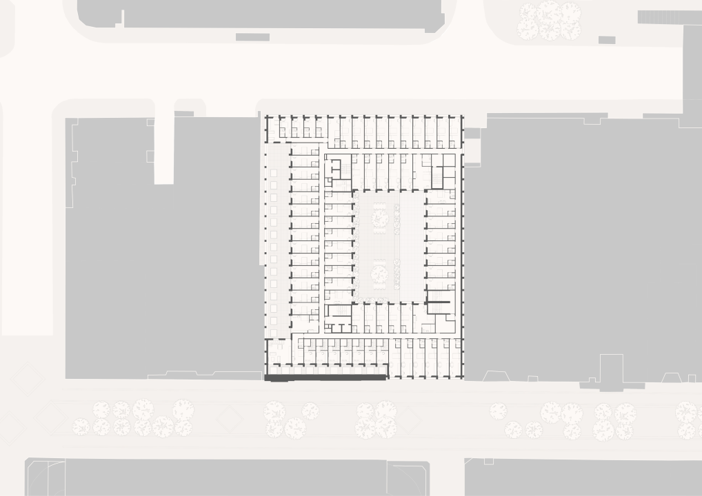
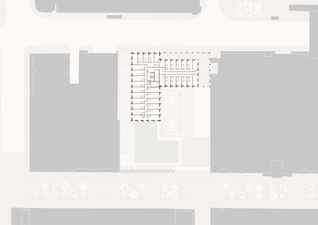
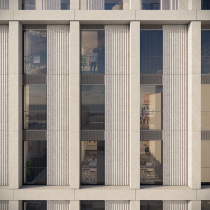
The courtyard block provides external amenity space and allows the site to be developed in keeping with the city grid. The stepped massing responds to solar orientation, maximising sunlight and daylight penetration to the external spaces and mediating between the existing scale of Sauchiehall Street and Renfrew Street. An expressed grid across the facade reflects the modular nature of the student accommodation whilst providing a framework for the stepped massing and a visual sense of robustness and solidity.
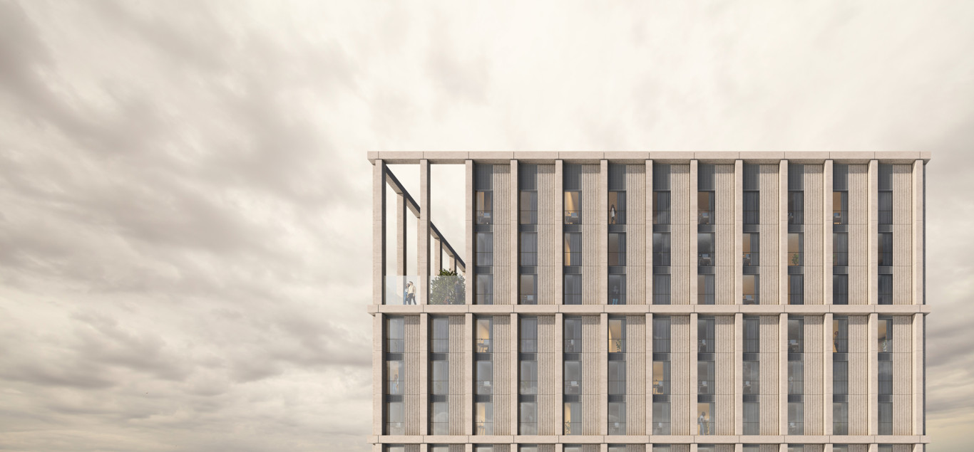
The strong expression of the horizontal and vertical grid references the rhythm of the city’s historic buildings including the former Waverley Hotel design by Alexander Thompson, which used to occupy the site. The depth of the facade combined with the pleated solid panels, which echo the fluted columns to the areas neo-classical buildings, draws upon the rich texture and detailing which underpins the conservation area’s character. The combined external appearance provides a strong sense of local identity, human scale and detail at a range of distances, which provides a changing visual appearance as shadow and light changes throughout the day.

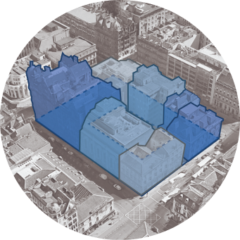
Working within Glasgow Grid
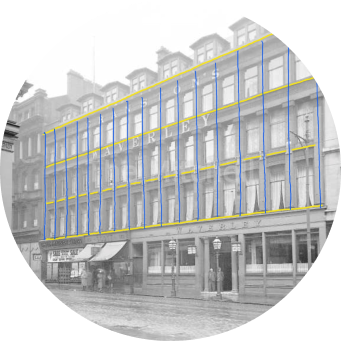
Responding to Local Context
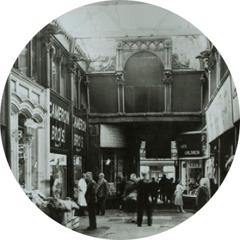
Reinstating Historic Arcade
There is a subtle variation in the solid elements of the external envelope, utilising a smooth and textured finish. The arrangement of these finishes is such to portray a solid element that has been carved/ hewn out with a smooth outer face and textured inner.
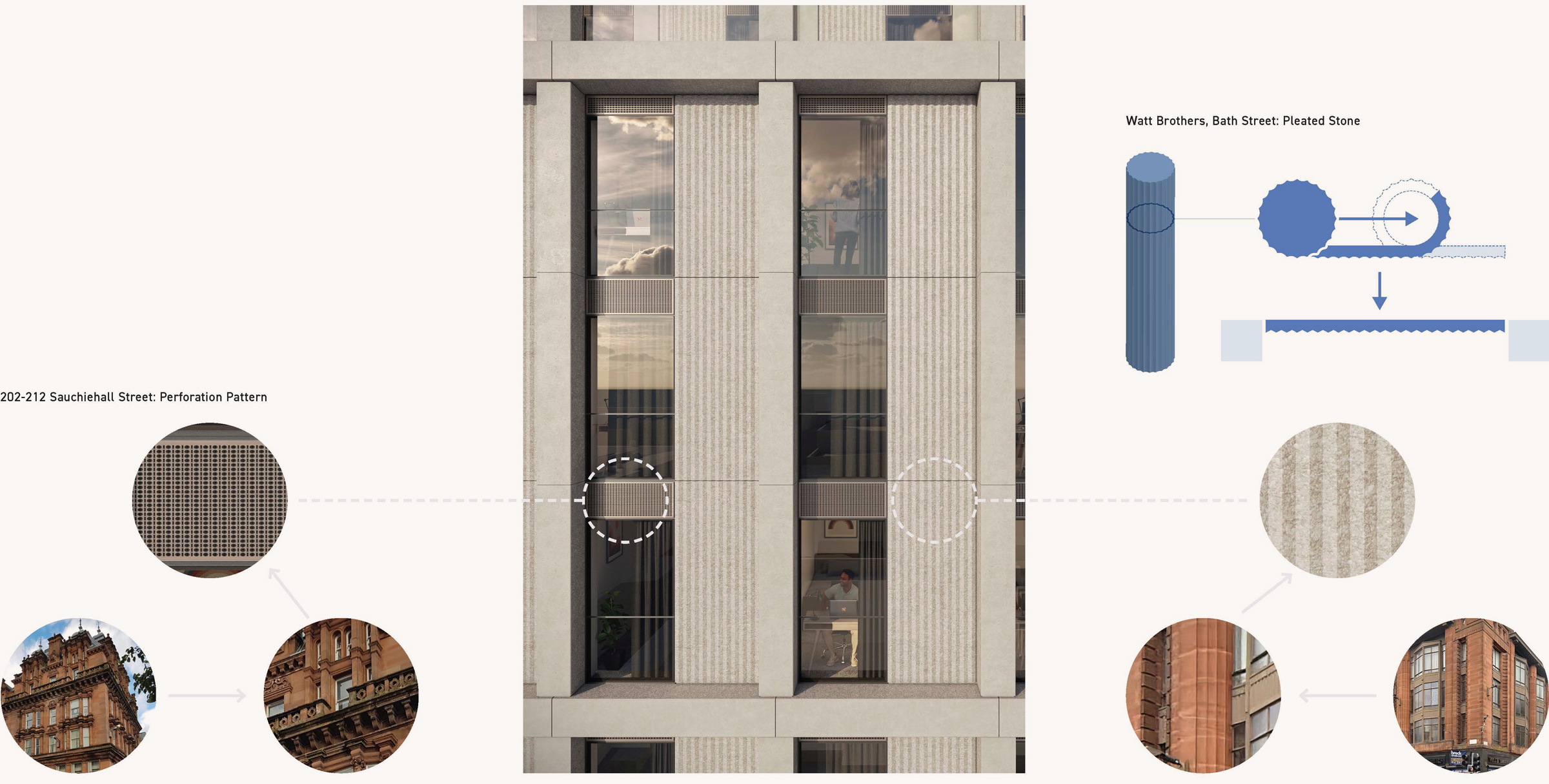
Contextually Driven Details
The appearance of the building proposals is derived from the context of Glasgow City Centre, in particular the historic building stock of the Glasgow Central Conservation Area. This includes taking inspiration from these buildings to inform the perforation and pleating patterns utilised within the facade design.
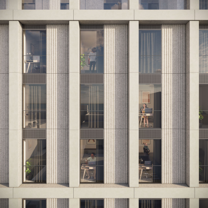
Morning

Midday
Evening
